Posts

Showing posts from 2019

Final Portfolio

Image
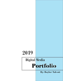
    This is my portfolio from FMX 210 class at the University of Tampa. It was the first time using any of these Adobe programs and I enjoyed the process of learning how they operate. I was able to learn from my mistakes and only get better from there. 

Business Card

Image
This is my business card I created using InDesign. The logo in the center was created in a project prior to this one. The pen and "314" represent my passion for writing and my hometown of St. Louis, Missouri. The colors on the card are a light blue and grey because it's relatively neutral but still adds a pop. I wanted to create a card that represented what I want to do in the future which is media management and producing. The social media logos on the right side represent the media aspects and the grey side is my contact information.

Cinemagraph

Image
This project was definitely one of the easier ones. The footage is from Davis island filmed around 7 p.m. the only challenge I ran into was her hair. It was very windy which made great movement for the water, but her hair was blowing everywhere. The colors I made limited because it offered more contrast to the water having her be dark rather than exactly colored. Other than that, I enjoyed this project and I plan on making more.

Meme Project

Image
Originally, I found this picture on Twitter with a caption saying, "Get you a man who know how to cook." Which was confusing because there was no man in the picture and the fish looks like the Dragon from "How to Train Your Dragon." So naturally I felt the need to notify everyone. Here you go.  The dragon is on the bottom right for a reference.

Autoscopy Project

Image
This is my as a space deer. There was really no other explanation for me doing this other than I like deer and I wanted to see my face on one. Additionally, the regular color, before the hue, would give most people nightmares due to the disarranged feeling you get when you see my normal face on a deer body. That being said, I made it all blue and orange and I feel that it blended better.

Somewhere Project

Image
Gum Wall  As a place I've always wanted to visit, the Gum Wall in Seattle, WA is a cool piece of history. The project overall was not challenging due to the image I selected along with my own picture. The lighting was complementary. It was overexposed in the top left corner and the same is for my picture. The only thing I changed as the lighting. By making it brighter, the light on my skin matched the image.

Photoshop Color Wheel Project

Image
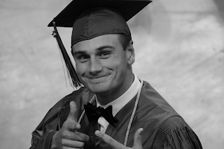
 This is the original black and white photo. Each picture took me some time to create. I used the layers option and the Quick Selection tool in Photoshop to color each part of my clothing. The project was relatively easy, and had little to no trouble. Analogous  Complementary  Compound Monochromatic  Shades  Triad

Poster Project

Image
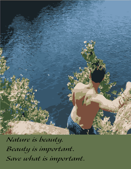
Nature and the environment are two things that are deeply important to me. I think that most people over think the global warming and climate change debates too much. Broken down, its actually really simple. Nature is beauty, beauty is important, so we should save what's important. Overall, this was actually a relatively hard project for me. I had to decide what picture would flow best with the poster outline and this was the picture I chose. It is me at my family lake house on Six Mile Lake in Ontario, Canada. The lake is pristine and I want it to stay that way so care about the Earth because we only have one.

Gradient Mesh Project

Image
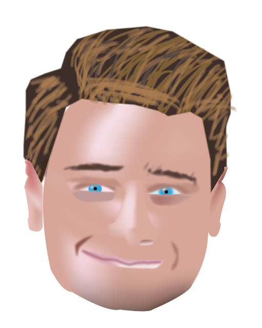
Probably one the hardest projects yet because of the fact I had little to no knowledge of the gradient mesh. I used google more than I had for any other project in this class and even spent 2 days of my spring break to figure out how to do it. Ultimately, while the final product may be rough, I am happy with that I was able to create for my first time using this program and even the format. The hardest part was the hair for sure due to the lack of brushes and the difficultly of going back and forth erasing the outlines then coloring it in. If I had to go back and recreate it, I would attempt to change the shading of the ears and the hair, because the largest flaws can be seen within those two objects. 

Logos

Image
When starting my logo design, I wanted to stick close to my roots. I love the outdoors and am fascinated by hunting, so the deer with the arrow in the top left was inspired by that. The pen tip and the "314" stands for my passion for writing while also incorporating my hometown of St. Louis, MO. The final mountains was derived from my last tattoo I have.  When I finalized my last two logos, I knew that I needed to add color. The addition of the color made the logos pop. I removed the mountains for my final one due to the poor design. The logo I am most proud of was the pen and the "314". It came out better than I had ever thought.

Calligram Project

Image
Calligram Project "Advice to a Son" - Ernest Hemingway  This calligram was inspired by my favorite poem written by the great Ernest Hemingway. His short poem, "Advice to a Son" is written repeatedly in different fonts depending on the person. The Father (figure on the left) has a clear poem written inside because he is the one offering it to his son. Symbolizing that he is wise and understands life better. The Son (figure on the right) has smaller font written inside him to symbolize that the advice is still unclear in him as he still has a long life to live. The poem is simple, clean, and precise which was why I created the image as such. Rather than adding complicated colors and doing more than needed, I stuck to keeping it transparent as Hemingway lived his life.

Trippy Underwater Turtle

Image
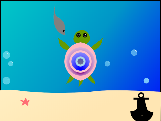
  Hours: 7 I decided to create an underwater landscape with a few sea creatures and an anchor. I drew my inspiration from my love for the ocean, and my love for the environment. The "trippy turtle" has a colorful shell and green limbs. He is accompanied by a grey stingray swimming above. The black anchor can be seen in the bottom right. Additionally, a little pink starfish can be seen in the bottom left. The bubbles are to help accent that it is underwater rather than above the sea. The project took me roughly seven hours to complete, but I enjoyed the struggle of mashing colors and creating different textures. <!DOCTYPE HTML> <html> <head> <script> window.onload = function() { var canvas = document.getElementById("myCanvas"); var context = canvas.getContext("2d"); //variables var x1 =0; var y1 =0; var x2 =750; var y2 =500; var rectx1 = 0; var recty1 = 0; var rectwidth1 = 800; var rectheight1 = 6...

What I Expect From FMX 210

Image
My impressions from the first class were mixed. Walking into my first "art" class since elementary school brought on more anxiety than joy. I have no artistic ability in me other than the basics of drawing a line with a circle on top and calling it a person. Ultimately, I am required to take this class but I also want to challenge myself and this is a perfect opportunity. I'm from Eureka/Wildwood/St. Louis, Missouri depending on who's asking. I personally enjoy the digital arts, but don't appreciate art as much as I probably should. I enjoy writing and I have interned for a magazine in St. Louis writing a few journalistic  articles . From this class, I expect to be challenged and to gain a lot of knowledge that I can apply to my career in the future.